MOREKO TEA
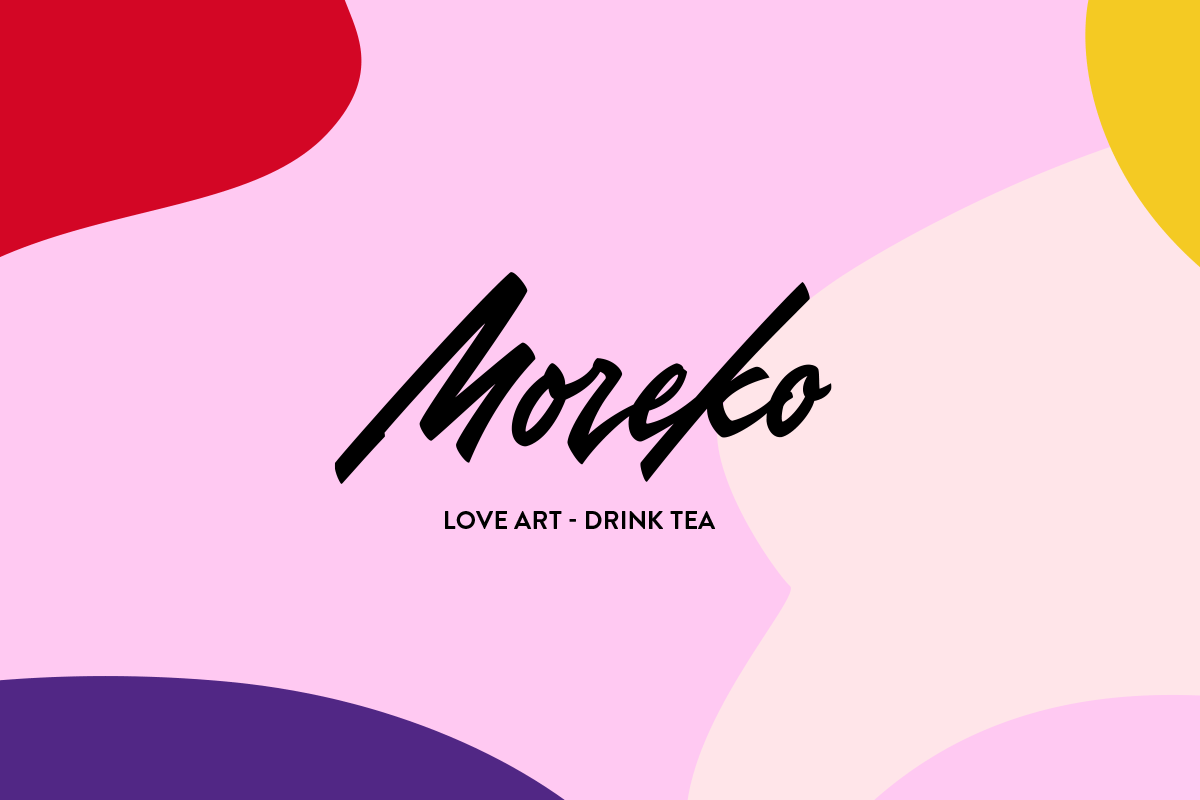
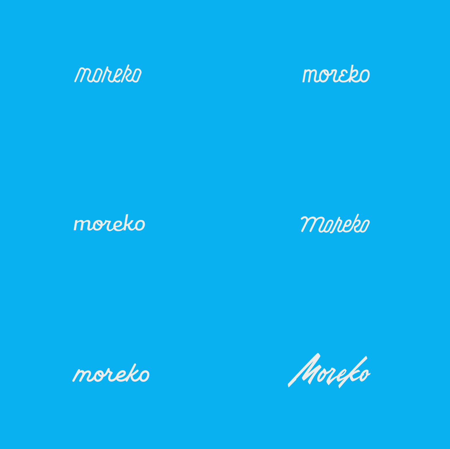
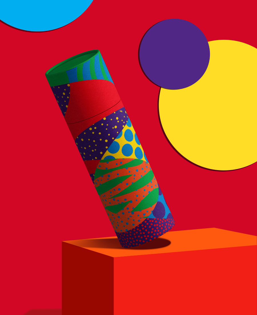
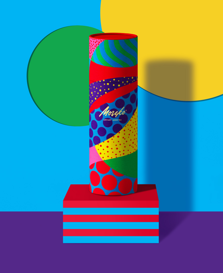
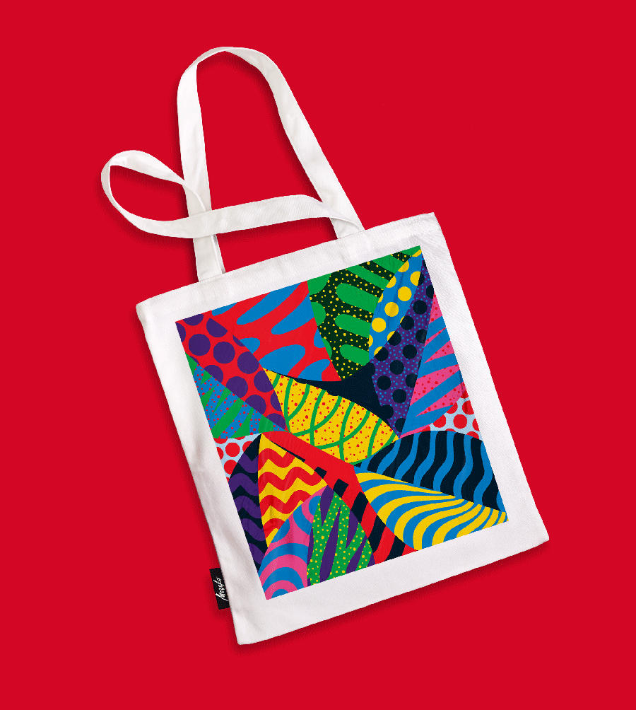
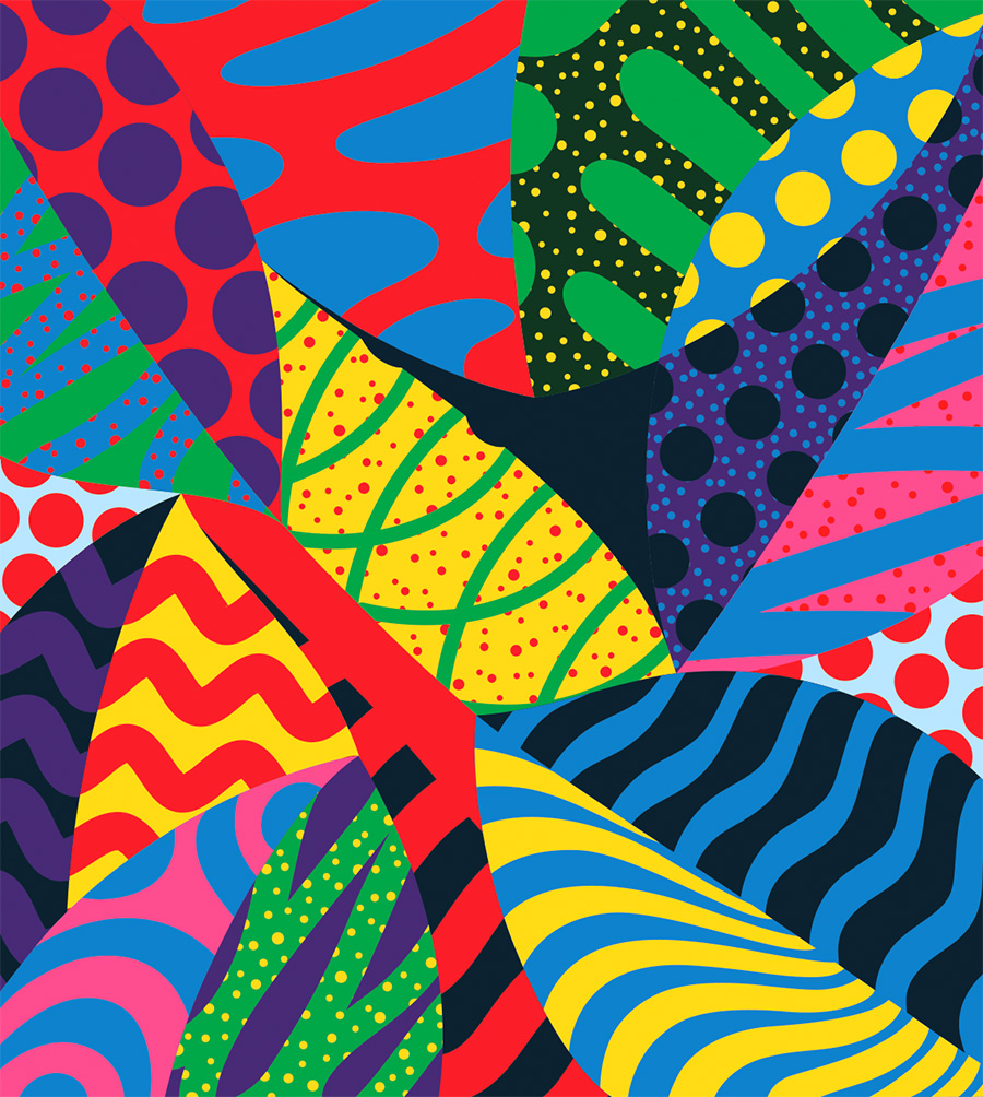
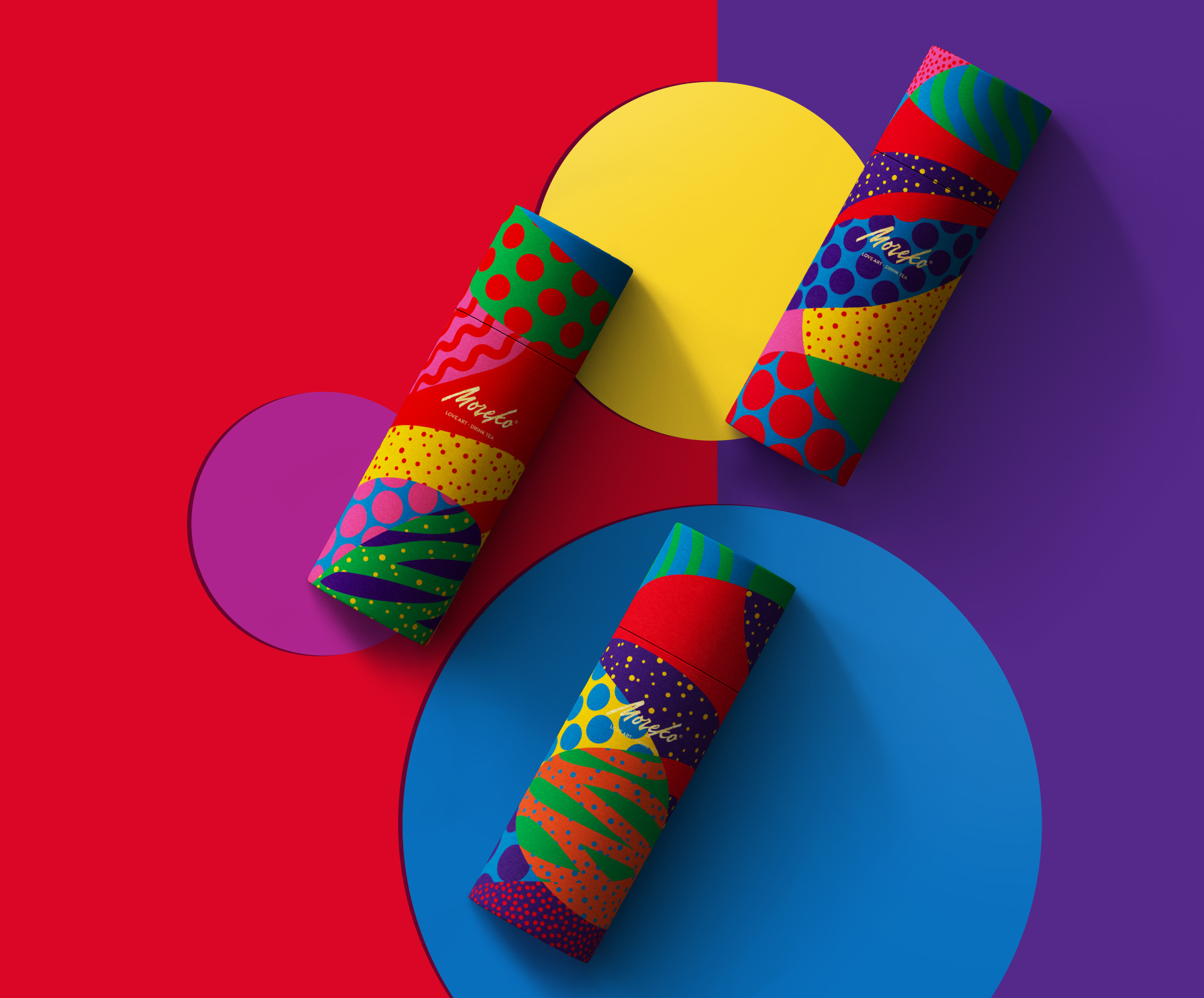
Moreko was born out of a love of art and a desire to do better. The logo/name was drawn using a brush pen to give a natural and dynamic flavour. A bright colour palette and geometric shapes made out of leaves were applied on the packaging and its entire graphic system to create a dynamic and enjoyable brand for the desired market.
Services
Art Direction Design Packaging
Art Direction Branding Packaging
Art Direction Branding Packaging
Client
Moreko
